CSS
 Edit on GitHub
What is CSS?
Cascading Style Sheets (CSS) is used to format the layout of a webpage.
CSS can be added to HTML documents in 3 ways:
- Inline - by using the style attribute inside HTML elements
- Internal - by using a
<style>element in the<head>section - External - by using a
<link>element to link to an external CSS file
<head><link rel="stylesheet" href="styles.css"></head>
CSS Box Model
All HTML elements can be considered as boxes. In CSS, the term "box model" is used when talking about design and layout.
The CSS box model is essentially a box that wraps around every HTML element. It consists of: margins, borders, padding, and the actual content. The image below illustrates the box model
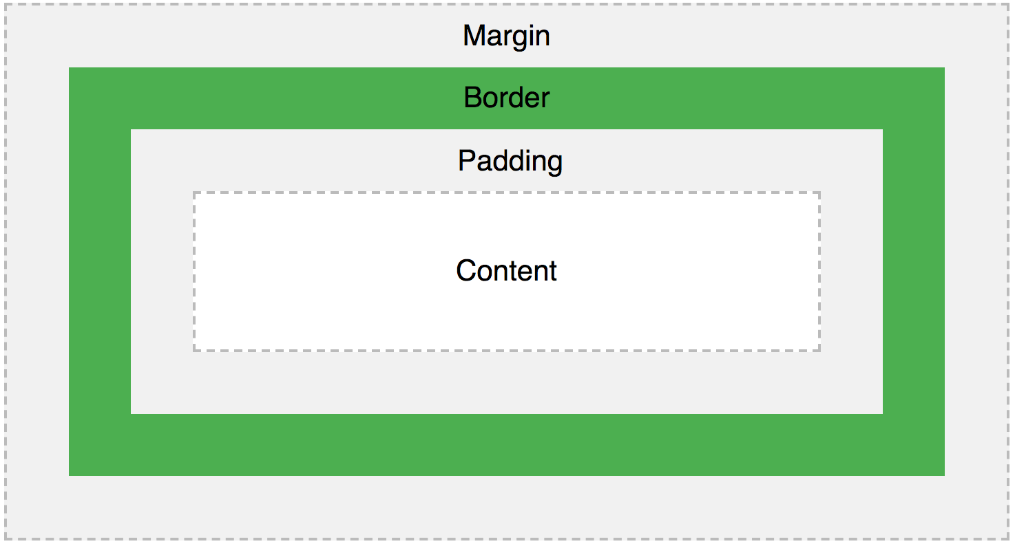
Explanation of the different parts
- Content - The content of the box, where text and images appear
- Padding - Clears an area around the content. The padding is transparent
- Border - A border that goes around the padding and content
- Margin - Clears an area outside the border. The margin is transparent
The box model allows us to add a border around elements, and to define space between elements.
Reference : https://www.youtube.com/watch?v=rIO5326FgPE How CSS works
Things to learns
- CSS Selectors
- CSS Box Model
- CSS Layout
- Styling Text with CSS
- CSS Units
- Styling Boxes with CSS
- CSS Colors and Gradients
- CSS Transitions and Animations
- CSS Transforms
- CSS Pseudo-classes and Pseudo-elements
- CSS At-Rules (e.g. Media Queries)
- CSS Specificity
- CSS Preprocessors
- Typography
CSS animation
Nowadays, animation has become a necessary thing for designing a website. Microinteraction has become a vital part of any website. So it is very important to understand the basics of CSS animation. Let’s start with an example:
.element {animation-name: stretch;animation-duration: 1.5s;animation-timing-function: ease-out;animation-delay: 0s;animation-direction: alternate;animation-iteration-count: infinite;animation-fill-mode: none;}@keyframes stretch{0%{width: 20px;}100% {width: 50px;}}
- Animation-name : Specifies the name of the @keyframes animation.
- Animation-duration: Specifies the duration of the animation
- Animation-timing-function: Specifies the curve in which the animation should work.
- Animation-delay: Specifies a delay to start the animation.
- Animation-direction: Specifies the direction in which the animation should work.
- Animation-iteration-count: Specifies the number of times the animation should work.
- Animation-fill-mode: Specifies the style to be applied to the element when the animation is complete.
@keyframes : It is the one which is responsible to do the expected animation to the particular element.
The shorthand for writing the above all is as follows: Format:
.element {Animation: animation-name animation-duration animation-timing-function animation-delay animation-iteration-count animation-fill-mode}
You should the same format
Example:
.element {animation: stretch 1.5s ease-out 0s alternate infinite none;}
Animation: The whole animation effect can be achieved by this shorthand animation
Reference :
Exercises
- Create a sign up form
- Build a Personal Portfolio Webpage